Programa FFR
Conceptual UI/UX redesign for FFR, a physical preparation and performance training agency for football players, focused on clearer service communication, stronger visual hierarchy and a conversion-oriented landing page.
- Web Design
- UI Design
- Type
- UI/UX Redesign / Concept
- Deliverables
- Landing page redesign
The challenge
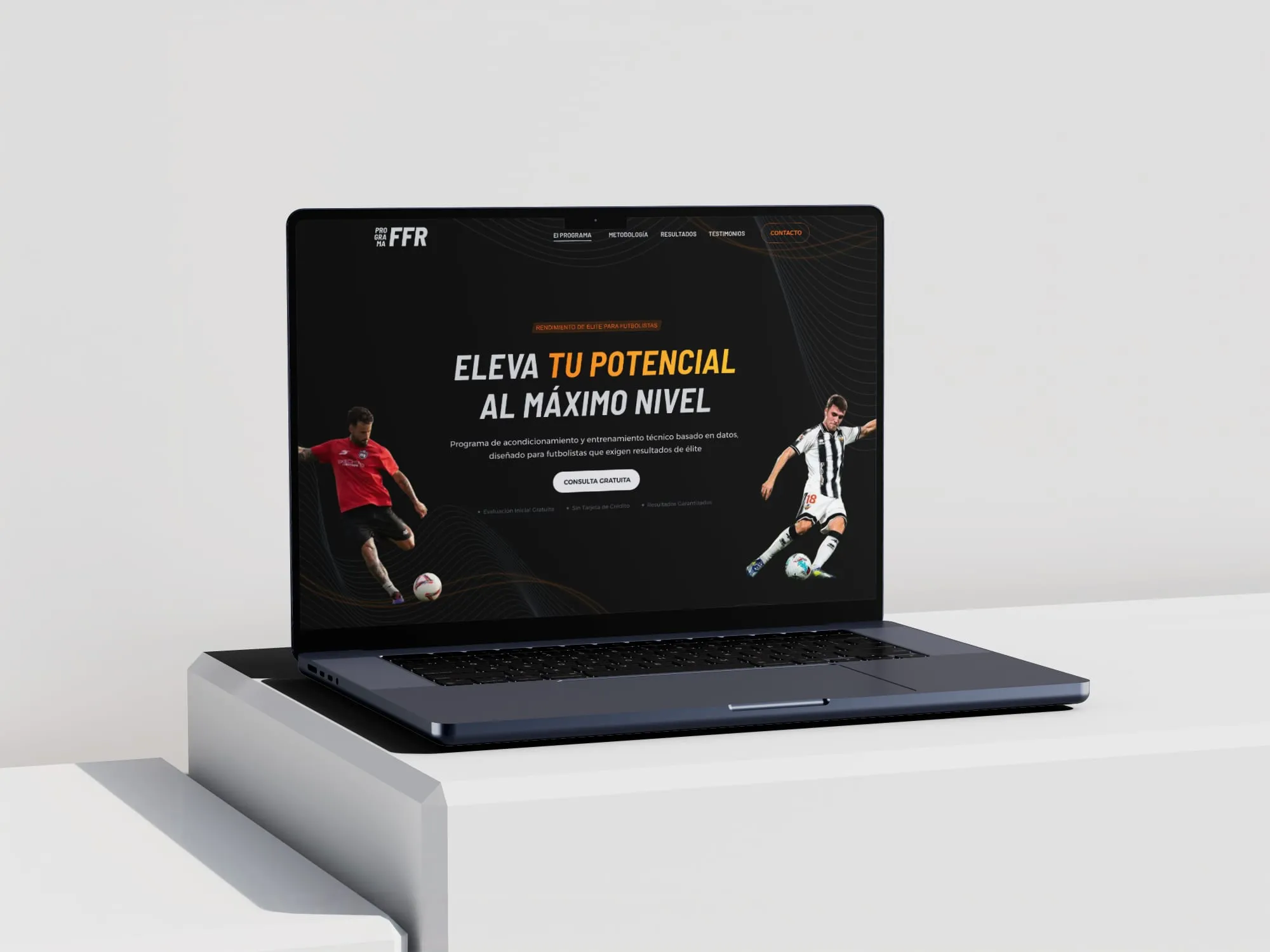
FFR is a physical preparation and performance training agency focused on football players. The agency had an existing online presence, but it was not doing enough to communicate the value of what they offer.
The website needed to answer the questions an athlete or club representative would have when visiting for the first time: what does FFR do, who is it for, what makes it different and how do you get in touch.
The challenge was not only visual. It was structural and communicative. The existing experience lacked a clear hierarchy and did not guide the user towards taking any particular action. The service offer was unclear and the contact flow created unnecessary friction.
The design needed to:
- communicate the agency’s expertise and identity clearly,
- build trust with a performance-focused audience,
- lead visitors towards a specific next step,
- and work well across both desktop and mobile.
My role
This was a self-initiated conceptual redesign. I was responsible for the full design process, working in Figma.
My work included:
- analysing the existing experience and identifying the main structural and communication gaps,
- defining a new page structure based on conversion logic,
- designing the visual interface,
- establishing a visual direction aligned with the performance and football context,
- and applying responsive thinking throughout the layout.
Approach
Leading with performance
The visual direction needed to communicate energy, credibility and professionalism. Football performance training is a serious, competitive space. The interface had to reflect that without feeling cold or generic.
The design uses strong visual hierarchy, clear typographic contrast and a visual aesthetic that supports the athletic nature of the brand. The goal was to make FFR look like an agency that serious athletes would trust.
Structuring for conversion
The page structure was rebuilt around a clear journey:
- The hero establishes immediately what FFR does and who it is for.
- The services section communicates the offer in concrete, athlete-focused language.
- Trust elements support credibility before the visitor reaches the call to action.
- The contact section is simple, direct and frictionless.
Each section was designed to serve a purpose in moving the visitor from awareness to action, rather than filling space with generic content.
Designing for athletes on mobile
Athletes and coaches are likely to encounter this page on their phones. The layout was designed to work well on smaller screens without compromising the visual impact or the clarity of the message.
The mobile experience was treated as a primary concern, not an afterthought.
Outcome
The result is a conceptual redesign that demonstrates how a performance training agency can communicate its value more clearly and professionally online.
The redesigned page gives FFR a stronger visual presence, a clearer service structure and a more direct path to contact. As a conceptual piece, it shows how I approach the redesign of a real business website: starting from communication gaps, not visual preferences.
Reflection
This project is a useful example of how design thinking applies to existing brands. The challenge was not to build something from scratch, but to take a real business and improve how it communicates its value. That kind of work requires understanding the audience, the offer and the conversion context before touching any visual decision.
Let's work together
Available for projects and remote collaborations across Europe and worldwide.
Get in touch